
The Nucleus Admin Redesign: Modernising a Decade-Old Interface
The Nucleus Admin Redesign: Modernising a Decade-Old Interface
A potential client once told me he’d seen two types of products in the awards management space: well-designed but lacking features, and feature-rich but lacking design. Then he said Nucleus fell into the latter camp.
I couldn’t disagree. This comment was the catalyst for something we’d known as a team was long overdue, but convincing management had been difficult. Now we had evidence. The client didn’t select Nucleus, and we began what would become a multi-year redesign process. The challenge was clear: modernise the product without breaking the workflows hundreds of users relied on.
The Nucleus design launched in 2013. Aside from minor updates based on static pages from an internal designer accustomed to print work, it hadn’t changed much since. At launch, to save costs for what was initially an internal product, we reused components designed for the front end. This worked initially but had become tired and outdated.
We’d already updated the front end, servicing end customers, after all, BAFTA and the awards organisations using the product prioritised their entrants over admin users. Once complete, we turned to the Events platform redesign, which had its own constraints tied to matching the BAFTA website. Having delivered a feature-rich Events product and with management’s desire to sell it externally, supporting end users again took precedence.
By March 2024, it was finally time to address the admin interface.
My first action was capturing everything the site used—pages, menus, components, assets. This would serve as reference for design and implementation, ensuring nothing was missed. Working in Confluence, I documented over 260 individual pages requiring design implementation. This wasn’t trivial work. Everything would need testing and review before launch.
Next came the business case and securing project funding. Before that, I needed to define the approach. I split this into three options:
Limited Redesign: Improve components and UI but keep page structure, workflows, and menus essentially the same.
Moderate Overhaul: Redesign core pages, update the UI, refresh menus, and improve workflows where sensible without restructuring existing implementation.
Comprehensive Redesign: Full-scale redesign changing everything—page structure, workflows, menus, components—without regard to current code.
Negotiating with the stakeholders including core admin users, our CTO, developers, and support staff, we settled on the moderate option.
Certain aspects needed updating including menu structure, all components and pages, with scope to reorganise sections. What we didn’t want was changing workflows too drastically. That would mean rewriting underlying code and adding significant complexity.
I was particularly keen to avoid radical changes requiring extensive retraining. I didn’t want to alienate users accustomed to the system, which could cost us clients and burden support teams who already needed to refresh all documentation. If we went too light, we’d miss necessary improvements. If we went too comprehensive, we’d alienate our user base.
For MVP, we kept the scope focused to updating the menu structure and modernise existing functionality. New features would come post-MVP, giving the team a clear implementation goal and stakeholders a clear understanding of the outcome.
The design needed to springboard new features, I had plenty in mind, but I didn’t want admins discovering multiple changes every week post-MVP. Keeping basic page and workflow structure intact felt like the right compromise.
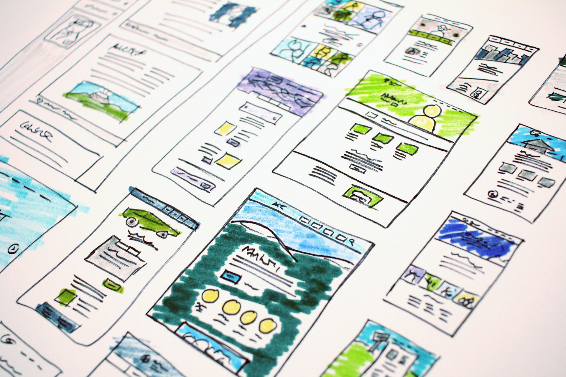
We worked with Alchemy Digital, who’d delivered the Events product design. With limited budget and wanting discipline, we agreed on a six-week delivery plan. I gave the designers instructions to include new features and ideas with the caveat that we might not implement them for MVP, so designs needed flexibility whilst adhering to WCAG guidelines.
The core challenge was conveying system workflows on a feature-heavy product to designers with no awards workflow experience. Even training new clients requires five to six hours of sessions. We agreed to focus on main pages then create generic designs applicable repeatedly. Nucleus is table-heavy—many pages are built around tables.
Before contracting the designers, I’d broken pages down into types. Data confirmed which were most used and important, so I asked designers to focus on these first. I also captured all components we used, asking designers to cover these plus components they’d used in other systems. I talked extensively about user flows, menu designs, and current product restrictions.
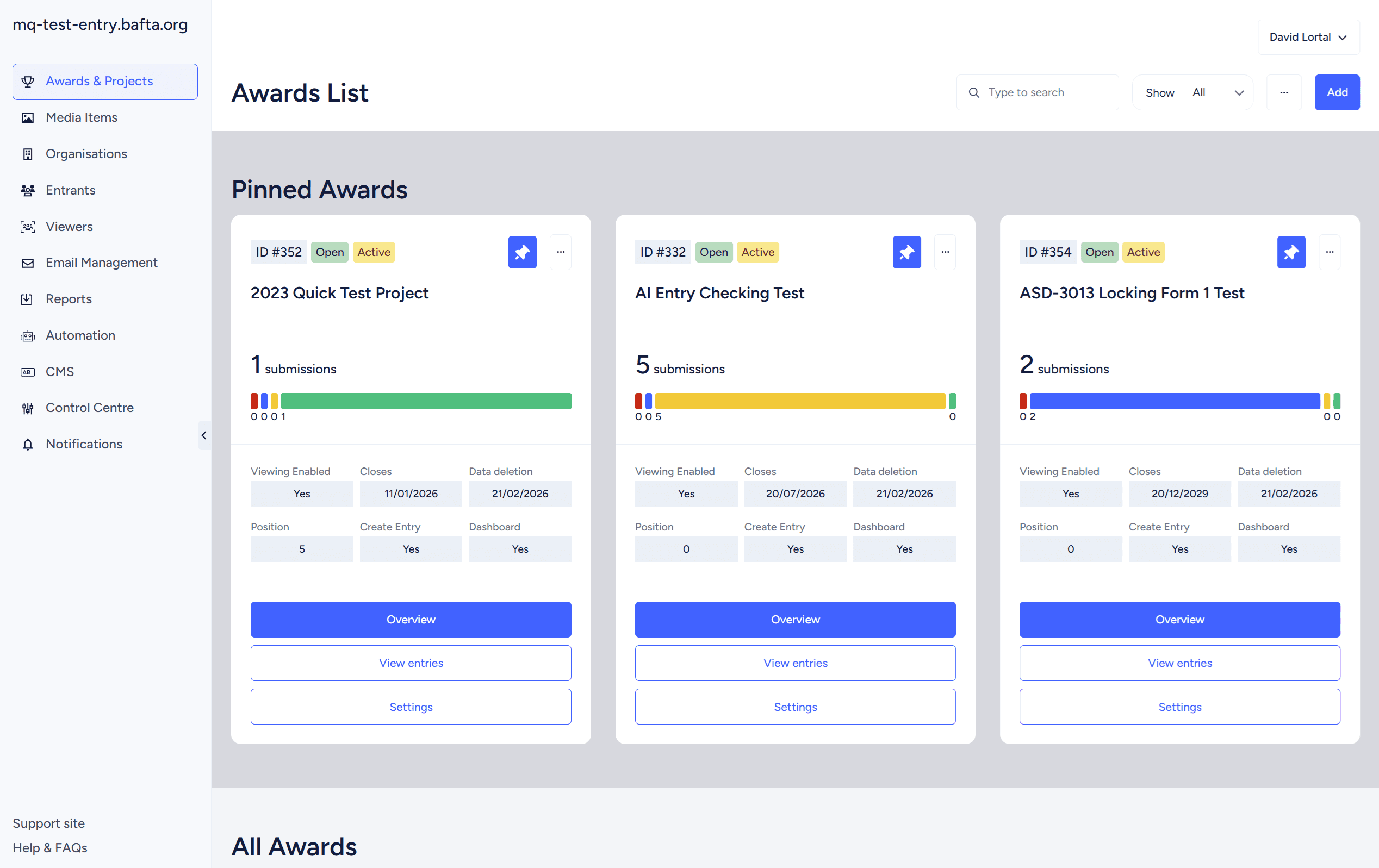
After the first week, I was impressed. They’d created a neutral, sophisticated design that worked well without necessitating huge tweaks. Considerable thought had gone into menu design. We moved from an initial dropdown to a sitewide menu and an award-specific menu.
Some components such as users, settings and communications, didn’t belong to an award, whilst others including the overview, entry management, question datasets did. This approach created coherent user journeys, allowing admins to stay within a project’s confines when managing it.
Once design assets were delivered in Figma, our front-end developer built templates. To keep costs down, I worked closely with them to build only examples of different pages and relevant components needed. Building all 260 pages wasn’t viable. Based on pages I’d captured, I determined there were 11 page templates needing implementation. We had 11 building blocks.
Alongside this, I started writing Jira tickets—one for each individual page.
Designers are excellent at providing attractive, functional pages filled with content and components. But what do pages look like when an award first opens with no entries? To save costs, we don’t request every situation from designers. This falls on me to make hundreds of design and implementation decisions as they arise.
After three major design projects, I decided to get further ahead. Writing tickets for 260 pages sounds tedious, but it surfaced critical issues:
Template fragmentation: Although pages fitted into 11 templates, more than 11 existed in current implementation. Developers had often worked separately, implementing features with little thought to page coherence. I used this opportunity to create uniform design.
Inconsistent messaging: There was no single approach to error handling or successful actions. A success could return a modal, toast message, load a new page, or close a page. I used new messaging provided by designers to create coherence.
Menu restructure: I defined primary and secondary menus, carefully considering which sections belonged where and validating with stakeholders.
The Misc page problem: This page was initially developed for functionality with no other logical home. After 10 years, so much had been added that it was a major hub but difficult to navigate.
Evidence showed reporting and email functionality were widely used but caused frustration being buried in sub-menus. I elevated these and linked functionality together. I also created a Control Centre containing functionality core to the product but rarely used, using the designer’s multi-menu page.
Decision logging: I worked with developers to capture complex implementation decisions, raising these in discovery meetings. Some had immediate effect on front-end implementation; others were captured for MVP or post-MVP.
MoSCoW prioritisation: I made decisions on what functionality should be included for MVP versus later. Design implementation took 2.5 months. During this period, we did minimal work on Nucleus to reduce conflicts when the design went live. I mitigated stakeholder frustrations by explaining what would be part of MVP and what we could fast-track post-MVP.
Future improvements: I noted changes I wanted to make post-launch. Some settings pages had become bloated. In other cases, controls were in wrong places.
For example, Nucleus can display data from any question on the dashboard, but the control was hidden in question settings—reasonable for the developer when building, but users would expect it on the dashboard. This was underused because users didn’t know where to go.
The finance feature was another example. Nucleus has wide-ranging finance features, but if an admin wanted to set category-specific pricing, they had to visit the category page, and the question list to set up another pricing mechanism. User feedback indicated this was confusing—they wanted everything on one page.
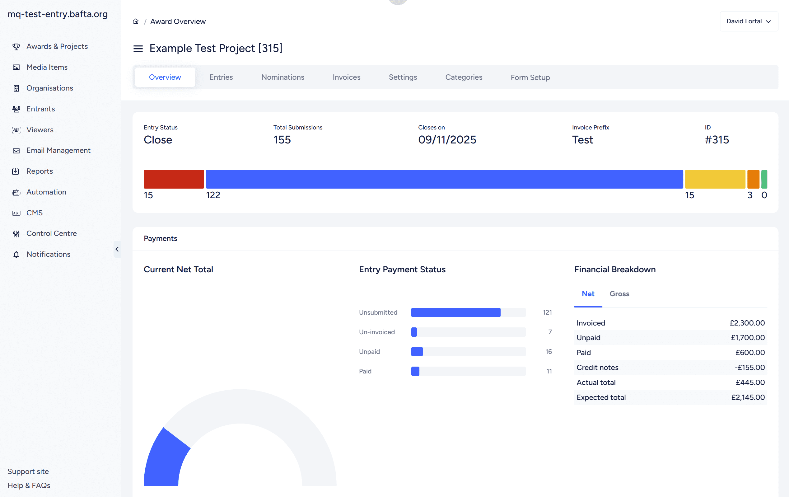
One of the most challenging decisions was the overview page. This was difficult for designers to design, and when implementation arrived, I needed to determine how it would work.
Designers included finance reporting, but not all awards charge fees, so this needed hiding. I kept trying approaches, creating mockups, and showing these to developers and stakeholders until it worked..
Implementation meant developers line-by-line replacing HTML and CSS with new designs, then I tested repeatedly. Because some workflows were being unified, there was new development, but the trickiest part was ensuring developers had distinct pages without crossing over one another.
For me, implementation was testing, feedback, reviewing, testing again. As this was the fourth time I’d run this process, I was experienced. One issue was engaging stakeholders—I didn’t want to show changes too soon so feedback would pertain to unfinished increments, but I wanted them to have access early enough before we went too far.
We agreed to wait until later to fully engage. They’d been involved with design and had their needs captured. We communicated that MVP wasn’t the end—there would be bug fixing, training, and feedback allowing us to implement new features.
The customer support team handled training with clients, and we released the design quickly over a couple of days. Everyone was engaged in advance. The design went live in February to positive feedback.
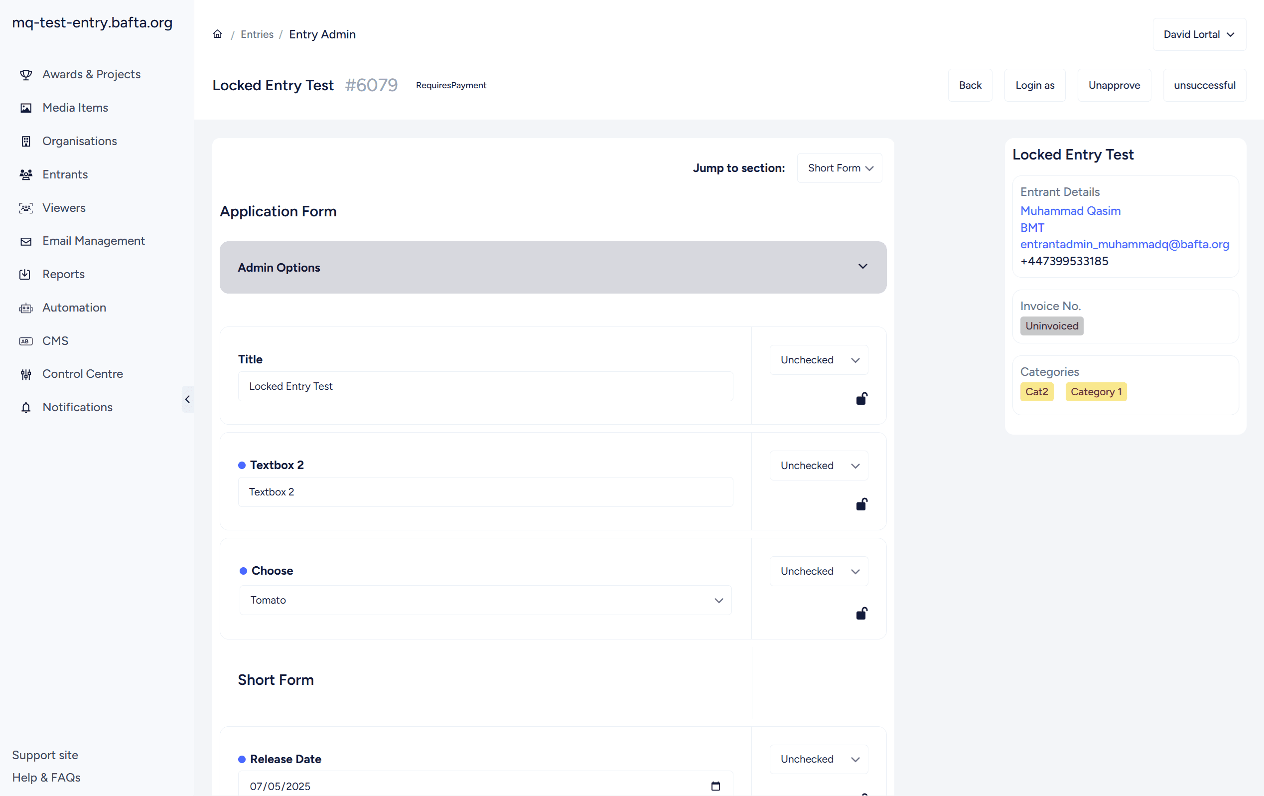
One item arose quickly. Nucleus had used row highlights previously, which isn’t accessible. As part of colours provided by designers, I’d updated these ensuring they met WCAG guidelines. However, one user reported that due to brightness and their individual needs, they had to use the monitor’s green screen, which resulted in all row highlights being the same colour.
I quickly researched, and with designer advice, we changed highlights to tags—a much better accessibility mechanism. Many stakeholders hadn’t been happy about their removal, necessitated by tag introduction. We worked with them and provided feedback, but this was one area not covered by designs.
Following user feedback, we fast-tracked dark mode implementation. This was made easier by the in-house designer who joined the team and quickly provided new colours, and the front-end developer who writes clean markup so colours could be slotted into existing CSS. This was released within months.
Post-launch, we incorporated feedback and delivered new features. I asked the in-house designer to review pages, especially where I’d made implementation decisions, and each update improved the site:
– Reorganised the finance section
– Introduced automations
– Updated the overview page with customisable data visualisation reports
– Allowed customisation of table data and column widths
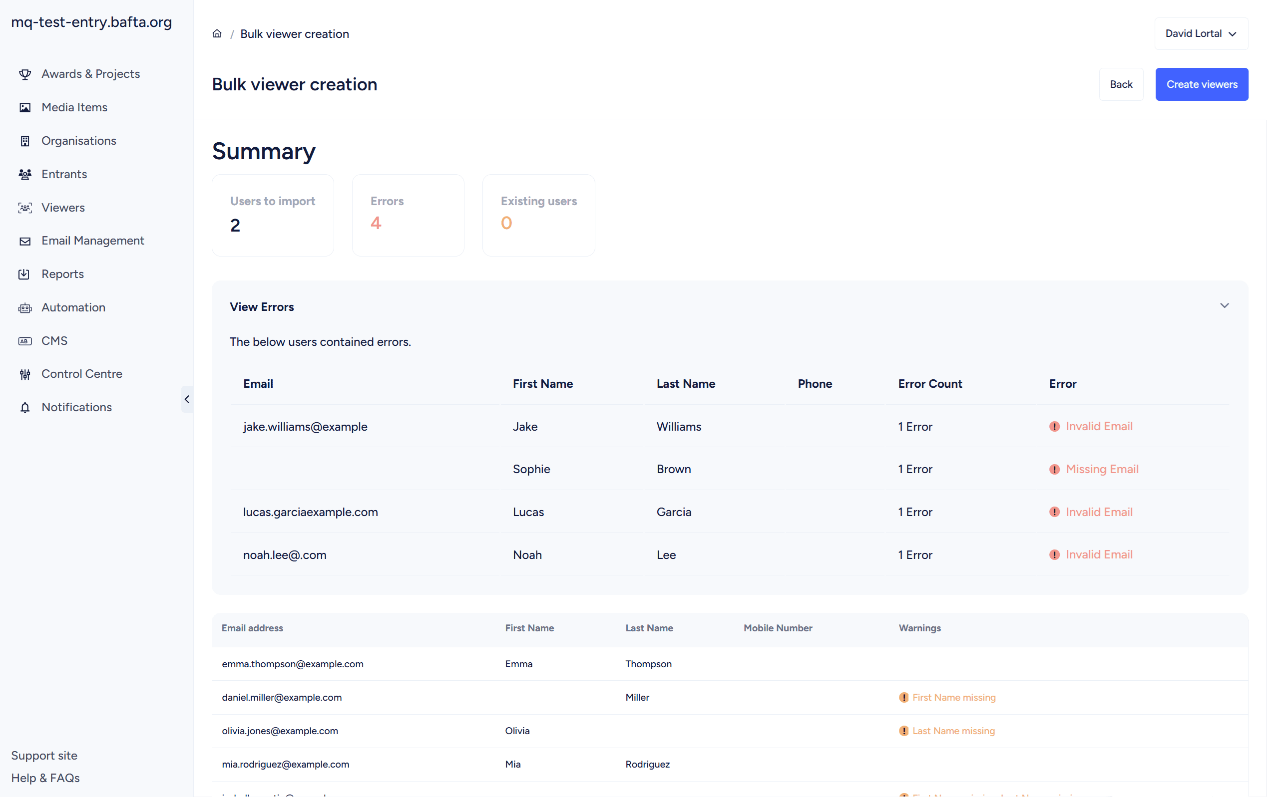
– Improved the viewer creation process
– Introduced alerts for admin users
The redesign achieved what it needed to: a modern, accessible interface supporting admin users whilst enabling continuous feature development. More importantly, it established a foundation allowing rapid iteration since launch.
The moderate approach was the right call. Enough change to modernise the platform, not so much that it alienated users or required extensive retraining.
The process reinforced something I’ve learnt across multiple redesign projects: getting ahead of implementation problems through detailed planning saves significant time during development. Writing tickets for 260 pages sounds tedious, but it meant identifying issues before developers encountered them, reducing back-and-forth and keeping the project on track.
The accessibility pivot post-launch demonstrated responsive product management. User feedback surfaced a genuine accessibility issue we hadn’t anticipated, and we addressed it quickly with a better solution than originally implemented. Launch with a solid foundation, then iterate based on real user needs.
The Nucleus Admin redesign wasn’t just a visual refresh. It was a strategic project balancing stakeholder needs, technical constraints, and long-term platform goals. The positive feedback and rapid post-launch feature development prove the approach was sound.
More importantly, it’s created the conditions for continuous improvement—which is what good product management should deliver.