
This is the second post of the serries, after improving judge creation workflows, where I’ve been looking back at some of the more impactful Nucleus features launched in 2025. The main focus of 2025 was the admin interface of Nucleus, but that doesn’t mean we ignored the core platform users. Entrants are the ones providing the data, videos and payment that make the system work. In this post I wanted to highlight a feature designed to solve a particular problem for BAFTA’s Awards team, who are always pushing the system to its limits.
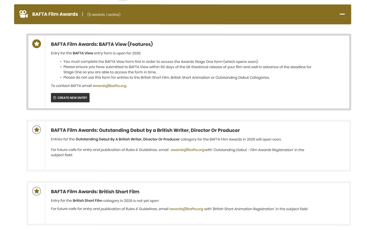
When Nucleus launched there were 7 awards forms. But Nucleus was designed as a sophisticated form building tool and the Awards team have used it for a large range of data collection methods beyond just entries, such as selling certificates and plaques. On top of this the awards process itself has grown and the levels of data required have extended. The Film award alone now covers 5 forms and the other awards have increased their form counts to take advantage of multi-stage entry workflows.
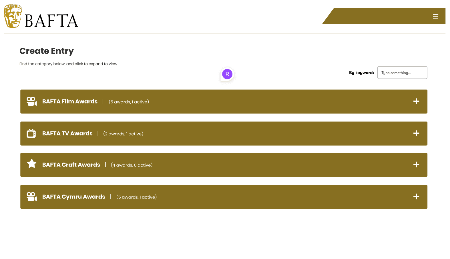
The result was that the Create Entry list screen, originally designed as a simple list of open awards to select from, had massively increased and the awards navigation had become difficult for the users it was meant to be simple for.
The problem
BAFTA’s awards are genre based: Film, TV and Games. On the whole it’s unlikely the same entrant will be entering multiple genres, and if they are they’re thinking in terms of the genre they’re entering. I spoke to some of the regular users of the platform and they confirmed that when they’re entering they want to focus on their award and ignore the others. That way it’s clearer for them to find the form they need.
The issue was that entrants were having to scroll through 16-20 programmes to find the right form. That’s too many options on one page, especially when most of them aren’t relevant.
The awards navigation solution
I decided we needed a filtering system. This could be tabs or sections, but something with clear UI to create buckets of awards that users could filter immediately. The aim was to reduce entrants from scrolling through everything to seeing 4 clear sections where they could focus and choose from 4-5 entry options. It would also give admins a way to bring more organisation to the page and create structure for entrants.
I worked with the designer and we mocked up examples. The criteria was to fit with the current design but create a new visual interface that was clear to users. After reviewing with stakeholders and running it past a group of regular entrants, we settled on a design that allowed the team to customise using icons and text. Admin features were then built to support the functionality.
Clients who run fewer awards might not need this, and we always need to support admins with vastly different use cases. The filtering is optional and configurable, so it doesn’t add complexity for those who don’t want it.
The impact
The result has been a visually clear organisation system that’s taken additional stress away from entrants facing high pressure deadlines. We’ve reduced time on the page by around 30 seconds per entry. That might not sound like much, but having a user stuck on a page for that long is problematic and enough to cause real frustration, especially when they’re under time pressure.
It’s a small change, but it’s made the entry process noticeably smoother for users who were finding the growing list overwhelming.
You may also like
Interested in working together?
I work with organisations to streamline workflows, modernise tools, and deliver systems that save time and enable teams to focus on the work that matters. If you're planning a project or refining a platform, get in touch.